By: Brent Fraser
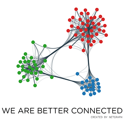
When creating network visualizations, a common challenge arises in ensuring that the final output does not appear cluttered and messy. Any image with more than a trivial number of connections can often look chaotic. Two possible remedies for this situation are edge bundling and node clustering. When challenged with creating a network cluster visualization for a t-shirt design for our Beer & Analytics event back in October, we opted to use netgraph, which can be found on GitHub. It is easy to use and is built on top of Matplotlib. Moreover, it is also compatible with NetworkX.
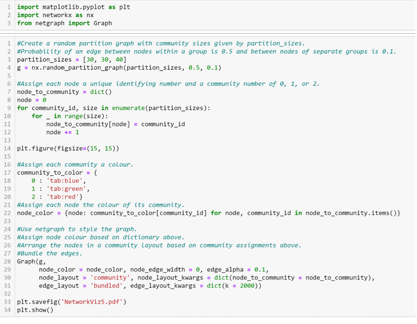
The code below is largely taken from netgraph example code. We used NetworkX to obtain a random partition graph. Then, we used netgraph to transform the graph into something much more visually appealing. We added a colour for each community, cluster nodes based on community, and bundled the edges.
Here are a few of the outputs that the code produced.
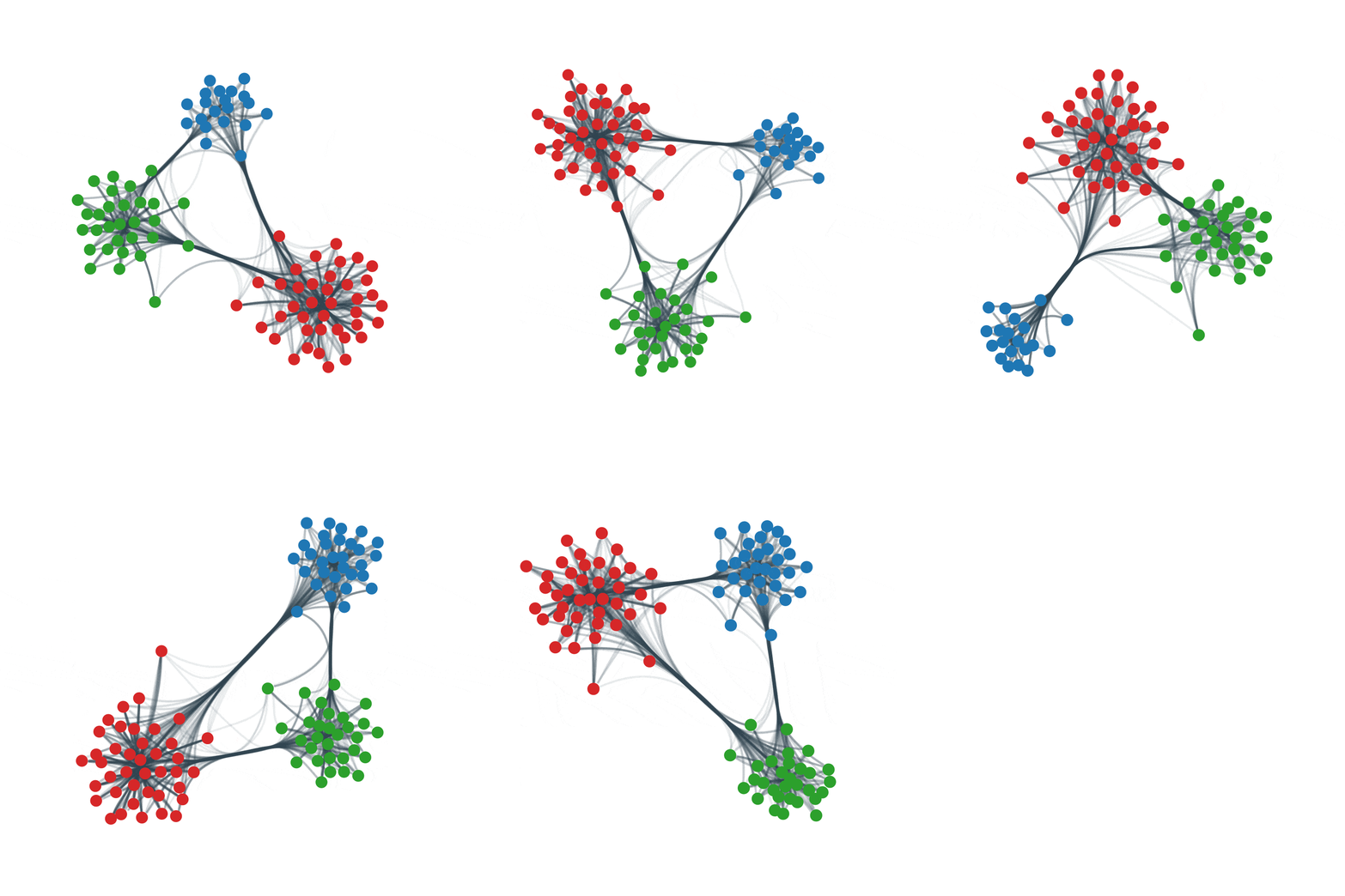
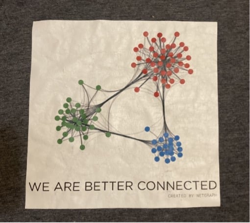
This code was run a few times and the best result made it onto the t-shirt seen below.
